










The Zapme Web 3 Brand ensures a consistent and impactful brand image in the world of digital currency & blockchain technology by providing clear communication and design guides
The Zapme primary logo for Web 3 is fixed artwork. It may not be altered or recreated in any way. The primary logo is the primary element of the company identity. Because it spells out the name of the company, use it in situations that require the brand to show up in an official capacity or to initially establish brand identity.
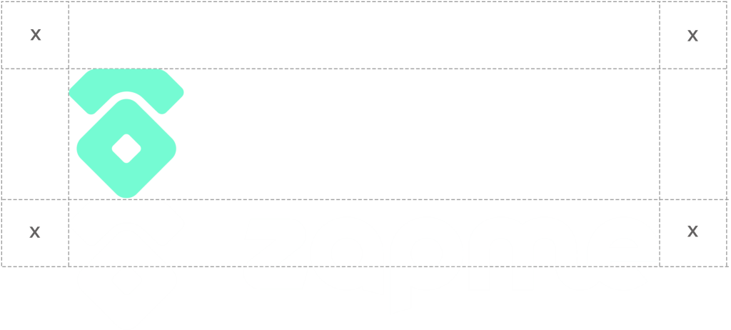
A margin of clear space equivalent to half the height of the logo itself is drawn around the wordmark to create the invisible boundary of the area of isolation.
Icon Mark
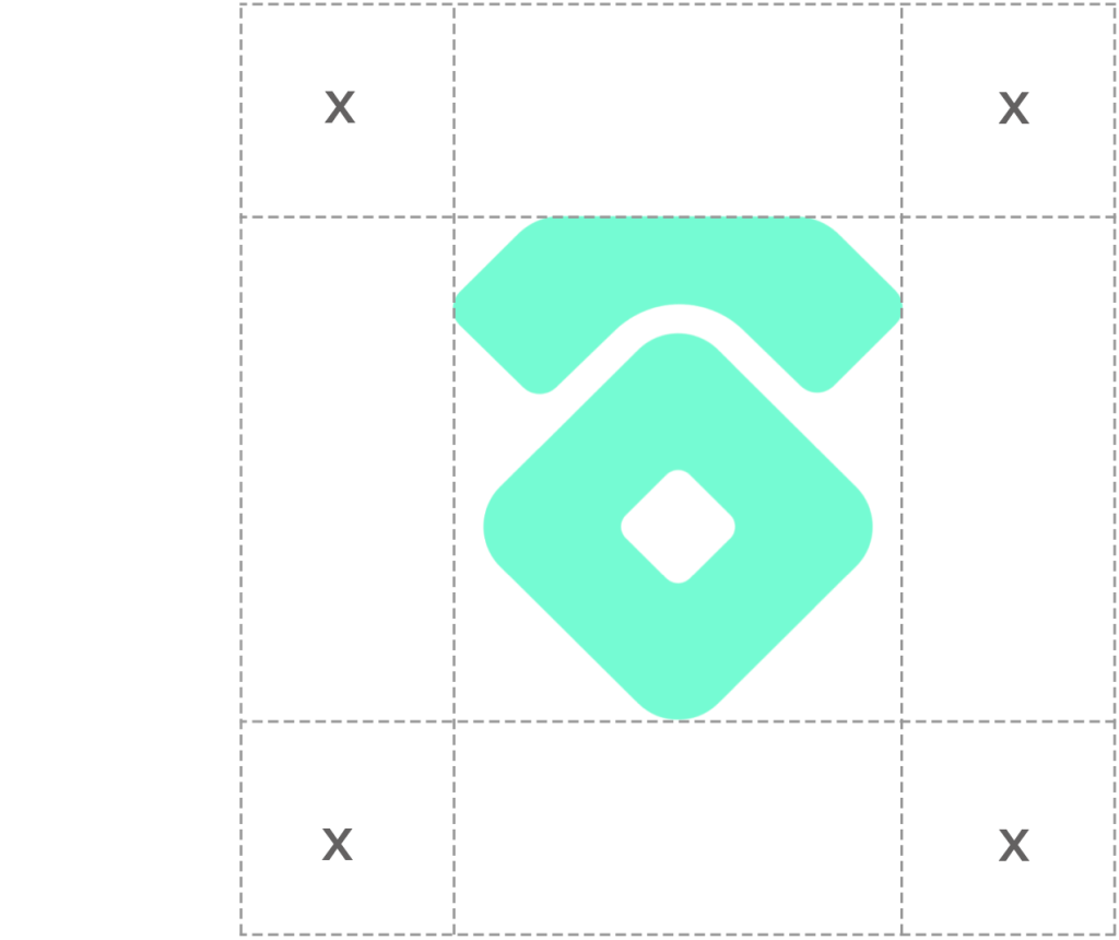
The Telephone icon mark represents many things important to the Zapme story. It is an abstract traditional telephone that is a fusion of the old traditonal way of communicating with a new modern way of communicating. The icon also serves as the home icon on the Zapme application, instilling it in the minds of the users.
A margin of clear space equivalent to half the width of the icon itself is drawn around the icon to create the invisible boundary of the area of isolation.
Token Logo
The ZAP token logo is a core visual element representing the identity of the token. As the emblem of the token, it should be used sparingly and with intention, primarily in contexts directly related to the ZAP token, such as token listings, investor materials, and official communications. By limiting its use, the logo maintains its strength, distinction, and recognition as the official mark of the ZAP token.